
How Colors Affect Human Behavior and Everyday Decision-Making
Understanding Color Psychology
How colors affect human behavior is an important topic in color psychology. Different shades can influence emotions, attention, and everyday decisions. Have you ever wondered why a bright red clearance tag grabs your attention or why a green room can feel calming?
Colors influence how we perceive our surroundings and respond to different situations. Understanding how the human eye works helps explain how we perceive different colors. The American Psychological Association (APA) offers resources on psychological research related to human perception, emotions, and behavior.
How Everyday Choices Are Shaped by Visual Cues
Every day, you make countless small decisions. You choose what to wear, which products to buy, and where to spend your time. Color can influence these choices, shape brand impressions, and affect how environments feel.
However, these effects vary depending on personal experiences, cultural associations, and context.
What This Guide Covers
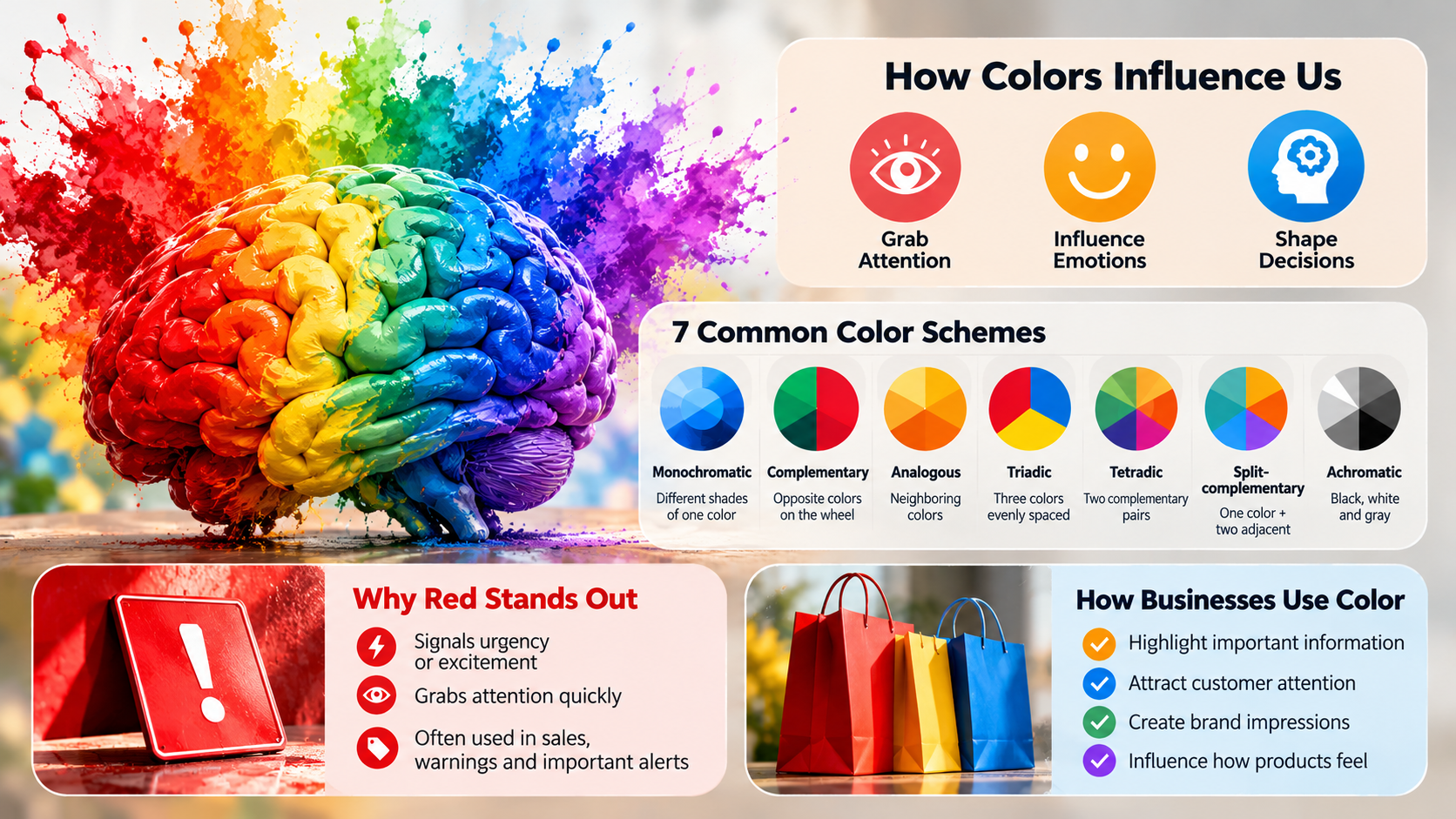
In this guide, we explore how different shades may influence mood, examine seven common color schemes, and explain why red often attracts attention. We also examine how businesses use color to shape customer experiences and influence everyday decisions.
How do colors affect human behavior?
Colors can influence human behavior by affecting attention, emotions, and the way people interpret their surroundings. When light enters your eyes, specialized cells in the retina convert it into signals that travel through the visual system. Your brain processes these signals alongside memories, learned associations, and environmental information. This process helps explain why certain colors feel inviting, calming, or alarming.
For example, red often signals urgency, danger, or excitement, while blue may suggest calmness, trust, or stability. However, these associations are not universal. The same color can create different impressions depending on its shade, surrounding colors, and cultural meaning.
Understanding how colors affect human behavior can help you make more informed choices about your surroundings. Designers may use calming palettes in relaxation spaces and contrasting colors to highlight important information. Businesses also use color to influence attention and shape product perceptions. These effects are better understood as influences on behavior rather than automatic controls over human decisions.
Evolutionary Wiring and Modern Action
Some color associations may have developed through interactions with the natural environment, while others come from culture and experience. Red, for example, can signal blood, ripeness, danger, or social importance. These associations can make red visually significant, especially when it contrasts strongly with its surroundings. However, evolutionary explanations alone cannot explain every human response to color.
How Businesses Use Color to Attract Attention
Modern businesses use these associations to make information easier to notice. Retailers often display discounts in bright colors, while warning signs use contrasting combinations to communicate hazards. Digital interfaces also use colored alerts to distinguish important messages from routine information.
The effectiveness of these visual cues depends on more than hue alone. Brightness, saturation, contrast, placement, and familiarity all influence how quickly people notice something. A red label may attract attention on a neutral background but become less noticeable when surrounded by other bright elements. Applying visual hierarchy in graphic design helps designers use color strategically, helping people identify priorities without overwhelming them with competing signals.
What are the 7 types of color theory?
The seven common color schemes describe different ways to combine colors using the color wheel. Designers use these relationships to create visual harmony, contrast, and hierarchy. The best choice depends on the purpose of the design, the intended audience, and the emotions or associations the designer wants to communicate.
Here are seven widely used color schemes:
- Monochromatic: Uses variations of one hue through different lightness and saturation levels. It creates a consistent, coordinated appearance.
- Complementary: Combines colors opposite each other on the color wheel. This creates strong contrast and helps important elements stand out.
- Analogous: Uses neighboring colors on the wheel. These combinations often feel cohesive and visually comfortable.
- Triadic: Combines three colors spaced evenly around the wheel. It can create a balanced design with noticeable variety.
- Tetradic: Uses four colors arranged as two complementary pairs. Careful balancing prevents the palette from feeling overwhelming.
- Split-complementary: Pairs one color with the two colors adjacent to its complement. It offers contrast with more flexibility.
- Achromatic: Relies on black, white, and gray rather than prominent chromatic hues. It creates a neutral, understated appearance.
These schemes help designers organize visual information and guide attention. However, color harmony does not guarantee a particular emotional response. The surrounding environment, contrast, and individual preferences also affect how people experience a palette. For practical applications, choosing colors for company branding can help businesses create a consistent visual identity.
What is the most powerful color in psychology?
Red is often considered one of the most attention-grabbing colors in psychology because it can communicate urgency, excitement, passion, or danger. Its impact comes partly from strong visual contrast and familiar associations. In some situations, red can increase alertness or make an object appear more prominent. However, it is not scientifically accurate to describe red as the most powerful color in every context.
Red can communicate different meanings depending on how people encounter it. A red warning sign may signal danger, while a red heart can represent love. In retail settings, red sale labels may help discounts stand out. In sports, red clothing has sometimes been associated with perceptions of dominance, although findings vary across studies and situations.
The effect of red also depends on brightness, saturation, surrounding colors, and cultural background. A dark burgundy may suggest elegance, while a bright scarlet may feel energetic. Red can sometimes increase tension or create a sense of urgency, but it does not automatically raise blood pressure or trigger action in everyone.
For practical use, choose red when you need visibility or a clear visual signal. Understanding how colors affect human behavior can help you balance red with neutral colors when a calmer experience is important. The goal is to make information noticeable without creating unnecessary visual stress.
How is color theory used in everyday life?
Color theory helps people organize visual information, distinguish important details, and create more comfortable environments. Its principles appear in public spaces, homes, workplaces, shops, and digital interfaces. Designers combine color, contrast, and visual hierarchy to make information easier to recognize and understand.
Traffic systems provide a familiar example. Red commonly signals stopping, while green indicates permission to proceed and amber warns of a change. These meanings rely on shared conventions rather than color alone. Shapes, positions, symbols, and written instructions also help people interpret signals correctly.
Color choices can influence how people experience commercial and personal spaces. Supermarkets may use lighting and coordinated displays to make products appear appealing. Hospitals and clinics often use carefully selected palettes to create a clean, reassuring environment. At home, creating a calm home environment can help support relaxation and well-being. Smartphone interfaces use accent colors to highlight notifications, buttons, and other important features.
At home, softer colors may help create a relaxing atmosphere, while contrasting accents can make work areas easier to navigate. In offices, designers consider lighting, glare, visual comfort, and task requirements when choosing colors. Although color cannot guarantee a specific mood or behavior, thoughtful combinations can improve usability and shape the overall experience of a space.
Strategic Visual Cues in Commercial Architecture
Retailers use color, lighting, signage, and spatial design to influence how customers navigate stores. Bright storefronts can attract attention from a distance, while clear signs help shoppers locate products. Inside a store, consistent color schemes can distinguish departments, highlight promotions, and strengthen brand recognition.
Some fast-food brands combine red and yellow in their visual identities. These colors can create a lively, energetic impression and help signage stand out in busy environments. Businesses can apply color choices for company branding to establish recognizable visual identities. However, it would be misleading to claim that these combinations automatically make customers eat faster or leave sooner. Customer behavior also depends on prices, service, seating, food quality, and crowd levels.
Other businesses use muted colors to create a more relaxed atmosphere. Hotels, clothing stores, and premium retailers may combine neutral palettes with carefully placed accent colors to communicate sophistication. Lighting also changes how colors appear, affecting the overall impression of a space.
Successful commercial design considers the full customer journey rather than relying on color alone. Businesses should test their palettes with real customers, evaluate accessibility, and ensure that important information remains easy to identify. Color works best as one part of a broader design strategy.
What are the psychological effects of colors?
The psychological effects of colors can include changes in attention, emotional associations, and perceptions of an environment. However, these responses vary between individuals and situations. Personal memories, cultural traditions, lighting, and color combinations all influence how a particular shade feels.
Here are some common color associations:
- Blue: Often associated with calmness, trust, and stability. Businesses frequently use it to communicate reliability, although responses vary.
- Green: Commonly linked with nature, growth, and renewal. It may feel reassuring in settings that emphasize the natural environment.
- Red: Often communicates urgency, excitement, passion, or danger. It can draw attention when used with sufficient contrast.
- Yellow: Frequently associated with optimism, warmth, and energy. Very bright shades can become visually intense when used extensively.
- Orange: Often conveys enthusiasm, friendliness, and activity. It can help create an approachable, energetic impression.
- Black: May suggest sophistication, authority, or seriousness. Its meaning depends on the design and cultural context.
- White: Commonly represents simplicity, cleanliness, and openness. Excessive use can sometimes make a space feel stark or clinical.
These associations are useful starting points, not universal psychological rules. A color that feels relaxing to one person may remind another of an unpleasant experience. Designers should therefore consider their audience, the setting, and the intended purpose before selecting a palette. The most effective approach is to use color alongside clear communication, comfortable lighting, and accessible design.
Frequently Asked Questions
Can color choices alter someone’s physical perception of room temperature?
Yes, colors measurably alter how hot or cold an indoor room feels. Research demonstrates that people perceive spaces painted in warm tones—such as terracotta, gold, or soft orange—as noticeably warmer than cool rooms. Conversely, walls finished in pale icy blue or light slate gray create an ambient sensation of crisp coolness, often leading individuals to adjust indoor thermostats accordingly.
Why do corporate financial institutions consistently use the color blue?
Financial institutions rely heavily on blue because it universally signals dependability, institutional stability, and fiscal integrity. Psychologically, blue lowers pulse rates and projects calculated calm, dampening the financial anxiety people naturally experience during investments. By surrounding clients with dependable navy and slate tones, banks subconsciously cultivate institutional credibility, corporate transparency, and mutual trust.
How does the color yellow trigger anxiety in certain indoor environments?
While soft yellow conveys warmth, highly saturated yellow overstimulates human photoreceptors and fatigues visual processing channels. When used extensively on walls, it bombards the retina with intense light, triggering visual irritation and mental restlessness. Studies indicate that prolonged containment within bright yellow rooms can elevate stress responses, foster impatience, and provoke emotional agitation.
Do individual cultural backgrounds change our psychological reactions to color?
Cultural upbringing significantly shifts the symbolic meaning and emotional reception of specific colors. While Western cultures associate white with purity and weddings, several East Asian traditions view white as an emblem of mourning and loss. Similarly, while green signals good fortune and growth in many societies, other regions view it as a warning of contamination.
Conclusion
Color is far more than a decorative design choice; it serves as a powerful psychological language that continuously directs how we experience reality. Throughout this exploration of how colors affect human behavior, we have seen how chromatic wavelengths stir primal evolutionary instincts, elevate physiological arousal, and simplify complex choices. Whether you are navigating busy traffic intersections, deciphering retail product walls, or focusing on demanding creative work, your brain constantly reacts to surrounding visual cues.
By understanding the foundational harmony models, the visceral authority of red, and the emotional resonance of cool versus warm tones, you can regain control over your environment. Use this valuable knowledge to make your personal workspace calmer, your study sessions more productive, and your buying habits far more intentional. If you want to explore how light and color interact in nature, discover why the sky is blue. The next time a vivid hue catches your eye, pause for a brief moment. Acknowledge the hidden psychological forces at play, and leverage color with deliberate intent to elevate your daily well-being.