
Understanding Visual Hierarchy in Graphic Design
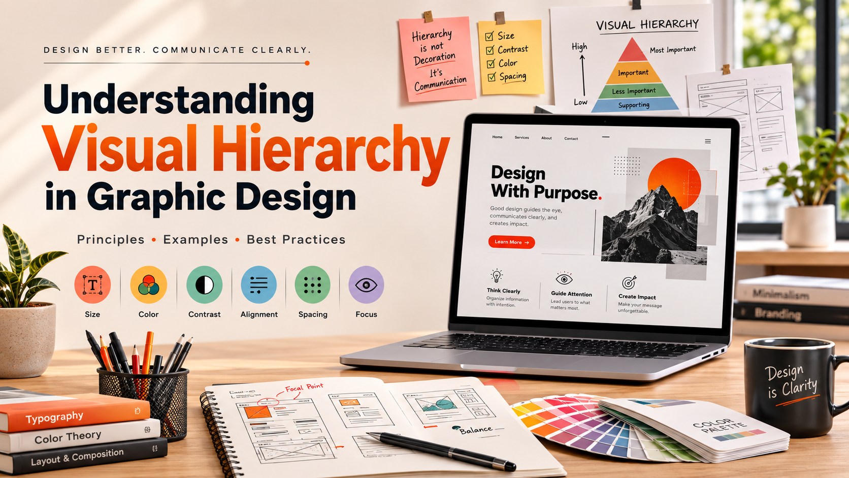
Mastering visual hierarchy in graphic design helps designers control how audiences experience creative work. It determines which elements viewers notice first, second, and last. This structure helps communicate important information without overwhelming the eye.
Designers use size, color, contrast, spacing, alignment, and placement to establish clear visual priorities. A strong hierarchy makes layouts easier to scan and helps viewers understand the intended message quickly. It also creates a more consistent experience across websites, posters, advertisements, presentations, and other visual materials.
According to the Interaction Design Foundation, organizing information visually can improve usability and comprehension. This principle applies across both digital and print design.
Whether you are creating a website or developing a promotional poster, arrangement matters. Understanding visual hierarchy principles can help you create designs that feel organized, intentional, and easy to navigate. This guide explores key hierarchy principles, information structure, graphic design types, artistic applications, and AI’s changing role.
What are the 12 visual hierarchy principles?
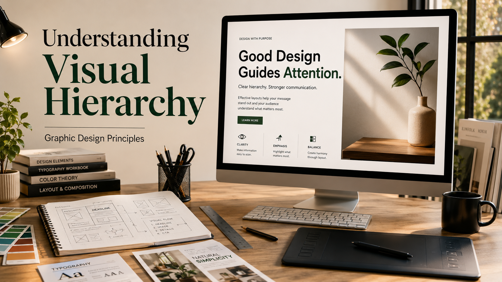
The 12 visual hierarchy principles provide a useful framework for organizing design elements according to importance. Designers use these principles to control how viewers move through a composition and identify its most important information.
Common hierarchy tools include:
- Size: Larger elements usually attract attention first.
- Color: Bright or distinctive colors can create strong focal points.
- Contrast: Differences in color, size, or weight separate important elements.
- Alignment: Consistent alignment creates order and visual relationships.
- Spacing: White space separates ideas and prevents clutter.
- Proximity: Related elements appear connected when positioned together.
- Repetition: Repeated styles create consistency across a design.
- Typography: Font size, weight, and style establish different information levels.
- Position: Elements placed strategically can receive greater attention.
- Scale: Proportional differences communicate relative importance.
- Shape: Distinctive shapes can attract attention within a uniform layout.
- Movement: Directional elements can guide the eye through a composition.
These principles work together rather than independently. A successful layout uses several techniques to create a clear path through the content.
The Power of Scale and Contrast
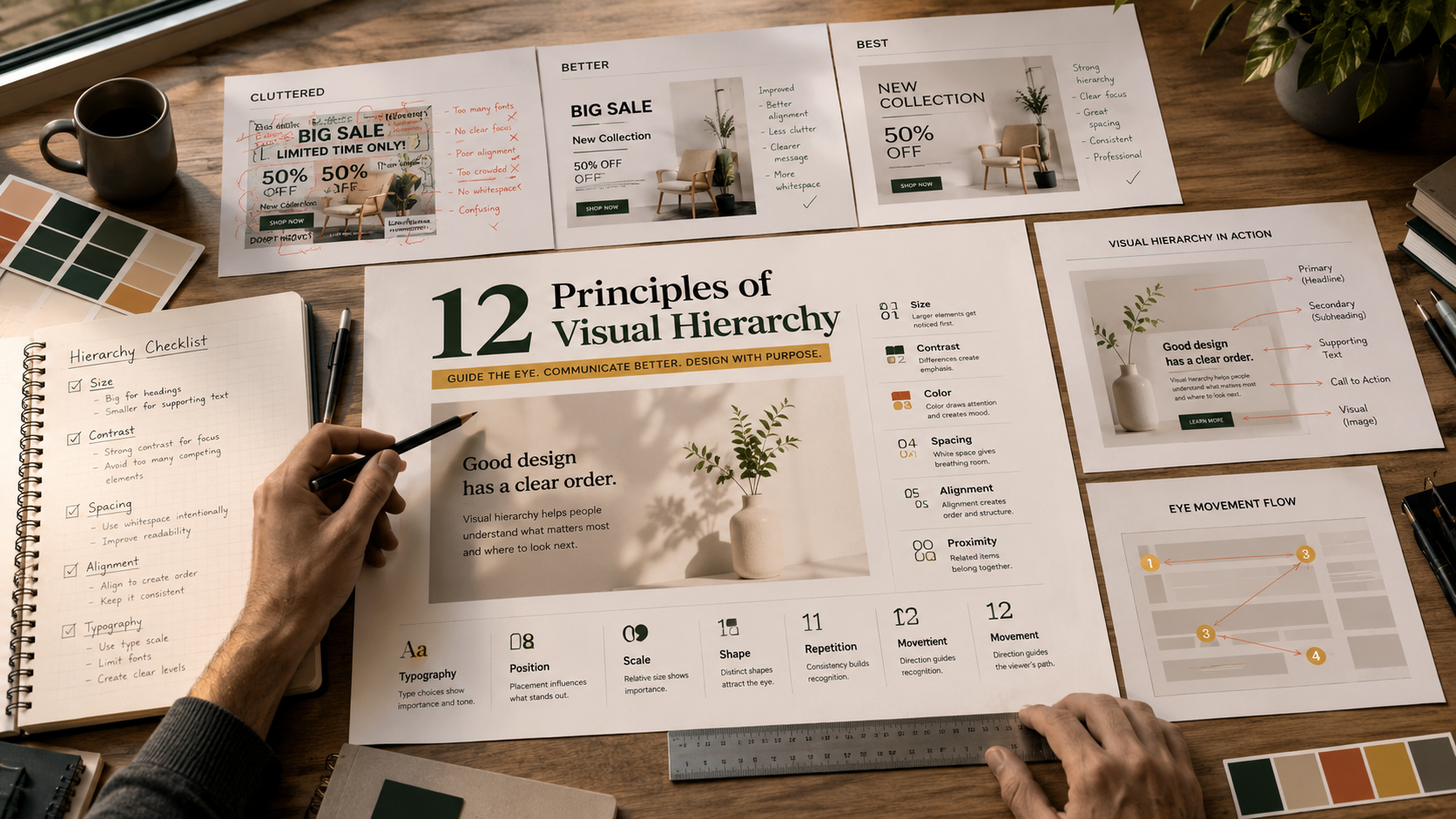
Scale and contrast are two of the strongest tools for creating visual hierarchy in graphic design. Scale communicates importance through differences in size. A large headline immediately appears more important than smaller supporting text.
Contrast creates separation between competing elements. Designers can use differences in color, brightness, weight, size, or shape to make specific information stand out. Strong contrast can establish a focal point and prevent important content from getting lost.
These techniques become more effective when designers use them together. For example, a large headline with strong contrast can establish the first visual level. Smaller text and softer contrast can then create secondary and tertiary levels.
However, excessive contrast can make a composition feel chaotic. Too many large elements compete for attention. Too many bright colors also weaken the intended focal point.
The goal is not to make everything noticeable. The goal is to make the right elements noticeable in the right order. This approach creates clearer communication and a more controlled viewing experience.
What is the visual hierarchy of information in graphic design?
The visual hierarchy of information in graphic design refers to arranging content according to its importance. It helps viewers understand what to notice first and where to look next.
Most designs contain several information levels. A primary headline usually receives the strongest visual emphasis. Subheadings, supporting information, captions, buttons, and body text then occupy lower levels.
Without a clear information hierarchy, viewers may struggle to identify the main message. A cluttered layout can increase cognitive effort and make important details easier to miss.
Digital interfaces often rely on familiar scanning patterns. Users may scan content in an F-shaped pattern or move through a Z-shaped path, depending on the layout. Designers can use these behaviors when positioning headlines, images, navigation, and calls to action.
Hierarchy also improves accessibility and usability. Clear differences between content levels help users scan pages quickly and understand relationships between elements.
A strong hierarchy does not simply make a design attractive. It gives information a logical order and helps the audience process the message efficiently.
Prioritizing Headlines and Body Text
Creating a clear distinction between headlines, subheadings, and body text keeps readers oriented. Each text level should have a recognizable visual role.
Primary headlines usually receive the strongest emphasis. Designers can increase their size, weight, spacing, or contrast to establish an immediate focal point. Subheadings should remain noticeable but less dominant than the main heading.
Body text should support readability rather than compete with larger elements. A comfortable font size, appropriate line spacing, and sufficient contrast can make longer content easier to consume.
Typography also creates relationships between sections. Consistent heading styles help readers predict where new topics begin. Similar formatting across related elements creates a sense of structure.
Designers should avoid making every text element equally prominent. If everything appears important, nothing has clear priority.
A useful approach is to establish a simple type scale before designing the complete layout. This creates predictable differences between content levels.
When typographic hierarchy remains consistent, readers can scan information faster. They can also understand the structure without carefully reading every word.
What are 7 types of graphic design?
Graphic design includes several specialized disciplines, each serving different communication goals. Seven widely recognized types include visual identity, marketing and advertising, user interface, publication, packaging, motion, and environmental design.
Visual identity design develops elements such as logos, typography, and color systems that represent a brand. Marketing and advertising design creates promotional materials for campaigns, products, and services.
User interface design focuses on digital products such as websites and applications. It combines visual communication with usability and interaction principles.
Publication design organizes content for books, magazines, newspapers, reports, and digital publications. Packaging design combines visual communication with physical product presentation. These skills can also be useful when creating better presentations for work, where clear visual organization helps communicate information effectively.
Motion design adds movement to graphic elements through animation and video. Environmental design uses graphics, signage, and spatial elements to help people navigate physical environments.
Each discipline requires different technical and creative skills. However, visual hierarchy in graphic design remains important across all seven areas.
Designers must understand how audiences notice information, interpret visual cues, and move through a composition. The tools and mediums may differ, but the underlying goal remains similar: communicate information clearly and effectively.
Exploring Digital and Print Specializations
Choosing a specific graphic design specialization allows professionals to develop deeper skills for a particular medium. Digital and print design share fundamental principles, but their practical requirements can differ significantly. Building the right combination of technical and soft skills can also help designers adapt to different roles and work environments.
Digital designers often work with responsive layouts, interfaces, interaction patterns, accessibility, and screen-based typography. User interface designers may also collaborate closely with developers and product teams.
Print designers work with physical materials and production limitations. Paper type, printing methods, dimensions, color reproduction, and finishing techniques can affect the final result.
Both areas require a strong understanding of composition and visual hierarchy. Digital layouts must guide users through screens, while print layouts must communicate effectively within fixed physical dimensions.
Specialization does not mean designers must work in only one medium. Many professionals develop transferable skills across digital and traditional formats. A strong portfolio without work experience can help demonstrate those transferable abilities when pursuing design opportunities.
Understanding typography, spacing, contrast, alignment, and composition provides a strong foundation for either path. Designers can then add medium-specific technical knowledge based on their career goals.
The right specialization depends on interests, strengths, preferred tools, and the type of work a designer wants to produce.
What is visual hierarchy in art?
Visual hierarchy in art describes how artists control the viewer’s attention within an artwork. It determines which subjects, details, or areas appear most important during the viewing experience.
Graphic design often uses hierarchy to communicate information efficiently. Fine art can use the same principles for different purposes, including emotion, storytelling, symbolism, and atmosphere.
Artists can create hierarchy through lighting, color, contrast, scale, positioning, perspective, and compositional lines. A brightly illuminated subject against a dark background can immediately become the dominant focal point.
Proximity and contrast can also establish relationships between different parts of an artwork. Complex compositions may contain several focal areas that guide viewers through a visual narrative.
Hierarchy can influence emotional response as well. A central figure may create immediate recognition, while subtle background details encourage viewers to explore the artwork gradually.
The technique appears across painting, photography, sculpture, illustration, and other visual disciplines. Artists decide which elements deserve immediate attention and which should remain secondary.
Although artistic goals differ from commercial design goals, the underlying principle remains similar. Visual hierarchy directs attention and creates order within a composition.
Utilizing Focal Points and Lighting
Focal points and lighting are powerful tools for controlling attention in art. A focal point is an area that naturally attracts the viewer’s gaze before surrounding details.
Artists can establish focal points through brightness, color contrast, scale, sharpness, position, or distinctive shapes. A subject placed near the center may attract attention, but position alone does not guarantee dominance.
Lighting can strengthen this effect. Strong illumination against darker surroundings creates separation and directs attention toward the highlighted subject. Artists have used this approach for centuries to create depth and dramatic emphasis.
The technique known as chiaroscuro uses strong contrasts between light and shadow. It can isolate important subjects while adding volume, depth, and emotional intensity.
However, effective hierarchy does not require dramatic lighting. Subtle differences can guide attention without making the composition feel artificial.
Artists can also combine lighting with color, perspective, and composition. These techniques create multiple levels of attention and encourage viewers to explore the artwork naturally.
The strongest compositions usually balance emphasis with restraint. Too many competing focal points can weaken the intended visual journey.
Is AI replacing graphic designers?
Artificial intelligence is changing graphic design, but the idea that AI will simply replace every graphic designer is too simplistic. AI tools can generate concepts, variations, images, and layouts quickly. They can also automate repetitive production tasks.
However, generating visual assets is only one part of professional design. Designers must interpret objectives, understand audiences, evaluate ideas, solve communication problems, and make strategic decisions.
Human designers also bring cultural awareness, emotional understanding, client communication, and brand knowledge to their work. These factors influence whether a design feels appropriate for a specific audience.
AI can support these processes, but generated output still requires human judgment. Designers need to select useful concepts, correct errors, refine compositions, and ensure consistency with brand requirements. For designers exploring these tools, how AI generates images provides useful context on the technology behind AI-assisted visual creation.
Companies and technology organizations increasingly position AI as a creative tool rather than a complete replacement for human decision-making. Designers who understand how to use AI effectively may improve their workflows and produce more variations in less time.
The role of the designer is therefore evolving. Instead of competing only on production speed, professionals can focus more heavily on strategy, creative direction, problem-solving, and communication.
The strongest approach combines efficient AI tools with deliberate human judgment.
The Value of Human Creativity
Human creativity remains important because effective design involves more than producing attractive visual assets. Designers must understand why a particular visual solution works for a specific audience and objective.
AI systems are highly capable at recognizing patterns and generating variations. They can help designers explore concepts quickly and automate repetitive tasks. However, generated options still require evaluation and refinement.
Human designers contribute personal experience, empathy, cultural understanding, strategic thinking, and contextual judgment. These qualities can influence decisions that cannot be reduced to visual patterns alone.
Brand identity provides a useful example. A designer must understand a company’s personality, audience, market position, and communication goals before selecting appropriate visual choices.
This makes creative strategy increasingly valuable. Designers who can explain their decisions and connect visual choices to business or communication objectives can offer more value than production skills alone, particularly when developing careers in digital marketing.
The future of graphic design is therefore unlikely to depend on choosing between humans and AI. Instead, designers can use AI for speed while retaining human control over direction and judgment.
As technology develops, professionals who combine design fundamentals with strategic thinking and effective AI workflows may remain highly competitive.
FAQ SECTION
How do I practice visual hierarchy in my daily design projects?
Practicing visual hierarchy starts by limiting your font weights and sizes to three distinct levels. Squint at your design from a distance to see if the main focal point stands out immediately. If your eye wanders aimlessly, adjust the scale and contrast until the intended path becomes crystal clear.
Does visual hierarchy matter for mobile app design?
Visual hierarchy is critical for mobile apps due to smaller screen sizes and limited user attention spans. Users make split-second decisions on mobile interfaces, so primary calls-to-action must be instantly recognizable. Proper layout structure prevents frustration and drastically improves overall user retention rates.
What is the difference between visual weight and visual hierarchy?
Visual weight refers to how much attention an element commands through its size, color, texture, or other visual characteristics. By contrast, visual hierarchy organizes these weighted elements into a logical reading order. In simple terms, visual weight is the tool, while visual hierarchy is the structured result.
Can color alone establish a strong visual hierarchy?
Color can establish hierarchy effectively, but relying on it exclusively causes accessibility issues for color-blind users. Pairing color variations with changes in size, weight, and spatial placement creates a foolproof hierarchy. Combining multiple design variables ensures your message reaches every member of your target audience.
Conclusion
Understanding visual hierarchy in graphic design empowers creators to build intuitive, engaging, and highly effective layouts. Throughout this guide, we explored core design principles, structural information ordering, distinct industry specializations, artistic applications, and the evolving role of artificial intelligence. By mastering scale, contrast, and spatial organization, you can guide viewer attention effortlessly across any medium. AI tools may automate repetitive tasks, but they cannot replace human strategic thinking and emotional nuance. We encourage you to apply these foundational hierarchy concepts to your next creative project to elevate both usability and visual appeal.