
Why Is the Android Symbol a Green Robot?
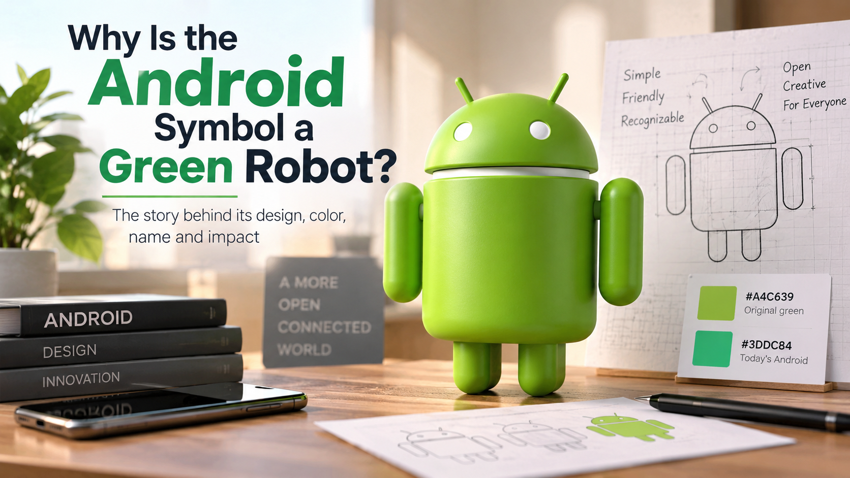
Every smartphone user recognizes the cheerful, antenna-topped character associated with Android. The Android green robot has become one of the most recognizable symbols in mobile technology.
When Android emerged in the late 2000s, mobile computing could feel technical and corporate. Google needed a visual identity that felt friendly, simple, and easy to recognize.
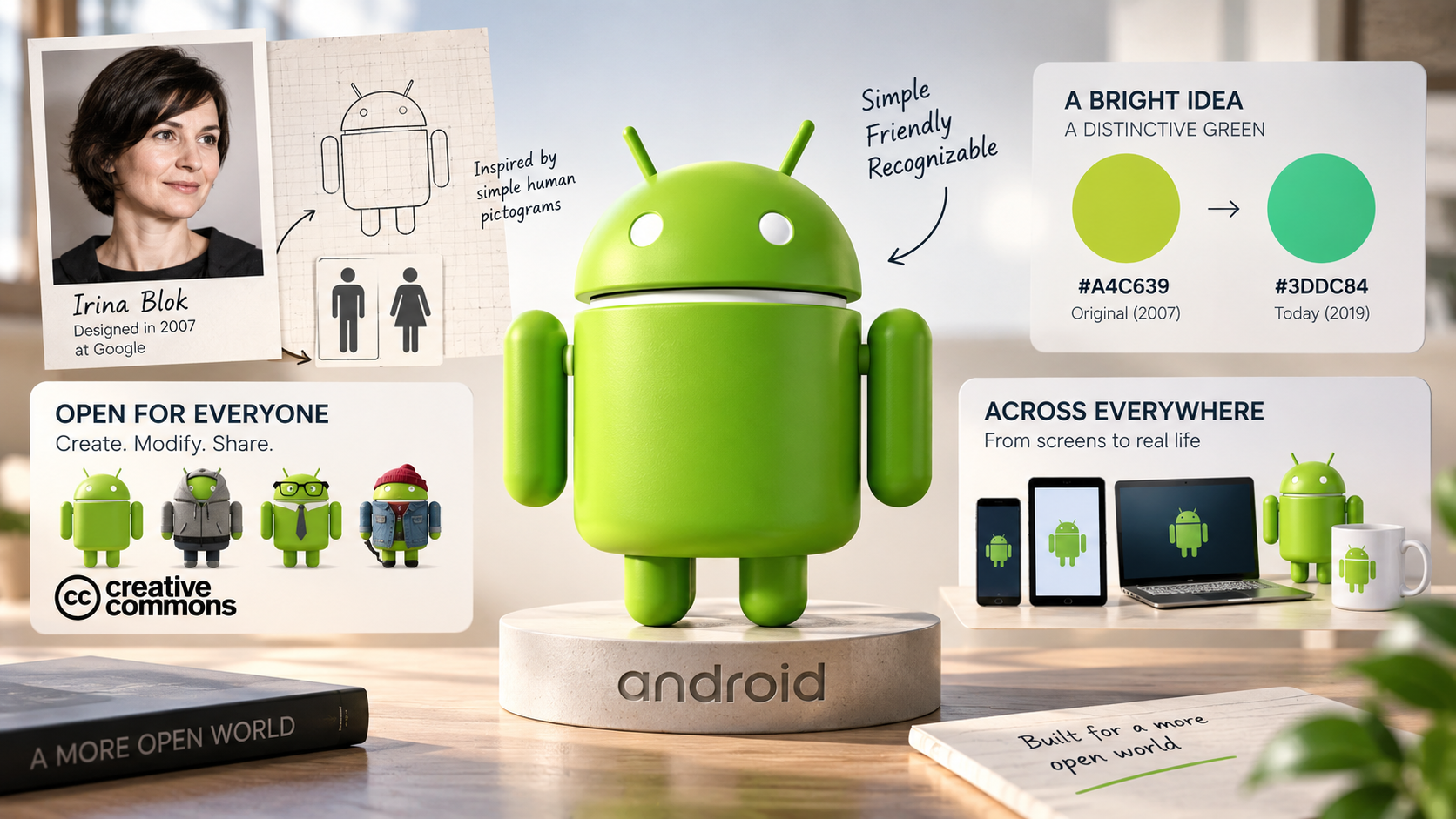
Graphic designer Irina Blok created the familiar Android robot in 2007 while working at Google. The design drew inspiration from simple human pictograms, including the figures commonly seen on restroom signs. The result was a minimalist robot that could work across screens, print, and physical products.
The design also reflected Android’s open and community-focused approach. The robot was made available under a Creative Commons license, allowing people to reproduce and modify it with attribution.
Over the years, the Android mascot evolved with the operating system. Its color, shape, and presentation have changed, but the friendly green robot remains closely linked with Android.
So why is the Android symbol a robot? Why is it green? And does the famous mascot have a real name? This guide explores the Android robot’s history, design, color, name, and cultural impact.
Why is the Android robot green?
The original Android robot used a bright yellow-green shade that became strongly associated with the brand. The original color was #A4C639, commonly identified with PMS 376C. Blok chose the shade because it stood out against dark backgrounds and connected with the green text seen on early computer displays.
That original shade helped people recognize the Android mascot. Its bright appearance also gave the platform a playful identity that differed from conservative technology branding.
However, Android uses a different green today. Google’s current Android brand guidelines specify #3DDC84 for online use and PMS 2412C for print. Google changed its visual identity in 2019 partly to improve accessibility and contrast.
If you see older references to #A4C639, they describe the original Android green. The modern brand color is #3DDC84.
The Contrast Value of Bugdroid Green
Color played an important role in making the Android mascot recognizable. The original bright green created strong contrast with darker backgrounds and helped the robot stand out across early digital interfaces.
The color also gave Android a distinct personality. Instead of using conventional corporate blue or gray, the brand adopted a lively green that felt more playful and approachable.
Android has changed its green over time. Google’s 2019 brand update introduced a more accessible visual system because the earlier green could create readability issues in some color combinations.
Today, Google’s official guidelines specify #3DDC84 as the Android robot’s online color. The same guidelines list PMS 2412C for print applications.
The familiar green therefore serves more than a decorative purpose. It forms an important part of Android’s established visual identity.
The color also helps the mascot remain recognizable across different branding eras. Even as the robot’s shape and presentation evolve, green remains one of its strongest visual associations.
Why is the Android logo a robot?
The Android logo is a robot because the name Android already refers to a human-like machine. In technology and science fiction, an android generally means an artificial being designed to resemble a person.
Google acquired Android Inc. in 2005. When the company developed the visual identity, a robot provided an obvious connection to the operating system’s name.
Irina Blok made that idea simple and approachable. Rather than creating a complex mechanical character, she used basic geometric shapes and a friendly silhouette. The design included a rounded head, two antennae, a simple body, and straightforward limbs.
Blok drew inspiration from universal restroom figures. Those signs communicate information through very few shapes. Applying the same principle to a robot made the Android mascot easy to understand.
The result was a character that looked technological without appearing intimidating. That simplicity helped the Android robot work well for developers, consumers, advertising, and merchandise, much as Android’s focus on usability extends to everyday tools and apps that simplify your routine.
Designing a Mascot for Software Developers
The original Android robot emphasized simplicity and flexibility. Blok designed it to fit Android’s open-source spirit without restrictive brand guidelines.
That approach allowed developers and artists to create their own versions of the character. They could dress, recolor, adapt, or place the robot in different situations.
This flexibility became an important part of the mascot’s identity. Developers could interact with the character instead of treating it like a rigid corporate logo, much like Android’s wider ecosystem supports practical tools such as free apps for Android users.
Google’s current Android guidelines still allow people to reproduce or modify the green robot. Users must include the required Creative Commons attribution. Google also retains trademark rights to the Android robot.
This distinction matters. People can adapt the mascot, but they cannot simply claim its trademark rights as their own.
The open approach helped turn the Android robot into more than a logo. It became a recognizable symbol of Android’s developer community and its emphasis on customization.
What is the Android green robot icon?
The Android green robot icon is the visual mascot associated with Google’s Android operating system. Its classic design features a rounded head, two antennae, a simple body, and rounded limbs.
The character became recognizable because of its minimalist construction. It uses only a few basic shapes, making it easy to identify even at a small size.
The robot has appeared throughout Android’s history. Google has used it in product branding, promotional material, developer resources, merchandise, and other Android-related experiences.
Google’s current brand identity gives the robot an even more flexible role. In 2023, Google introduced a refreshed visual identity featuring a more dimensional 3D version of the bugdroid. The updated robot can adapt across digital and real-world environments.
The classic green robot remains important even as Android’s branding continues to evolve.
Its simple design also helped it become a cultural symbol. People can recognize the character without seeing the Android wordmark.
An Open-Source Global Cultural Symbol
The Android robot became closely associated with the platform’s open and customizable culture. Developers and artists have created countless variations of the character over the years.
The mascot’s licensing also supports that flexibility. Google’s current brand guidelines allow people to reproduce or modify the Android robot when they include the required Creative Commons attribution. That same culture of customization is also reflected in Android’s many user-facing features, including ways to make your Android home screen useful.
This openness has helped the robot appear in many different contexts. Artists and developers have adapted it for illustrations, promotional campaigns, projects, collectibles, and other creative work.
That approach remains unusual for a major technology brand. The Android robot feels less like a fixed corporate emblem and more like a character that can change with its community.
Google reinforced this idea during its 2023 brand refresh. The company described the robot as a recognizable part of the Android community and introduced a more expressive 3D version.
That evolution explains why the mascot remains relevant. Its basic identity stays recognizable while its appearance changes with technology and culture.
Does the green Android robot have a name?
For years, the Android robot had no universally accepted official public name. The Android team reportedly used the nickname Bugdroid, and Google used that term in its 2023 brand announcement.
The word combines “bug” with “droid,” giving the character a name that fits Android’s software and developer culture. However, it makes more sense to describe Bugdroid as a long-standing nickname than as the mascot’s formal public name.
Google’s 2023 announcement specifically referred to the robot’s recognizable face as the bugdroid. The company also introduced a refreshed 3D version of the character as part of its new visual identity.
The terminology has evolved over time. You may see the character described as the Android robot, Android bot, bugdroid, or simply the Bot.
For people searching for the familiar green character, Bugdroid remains the most recognizable informal name.
The important point is that the mascot’s identity remains closely tied to Android’s playful, developer-friendly personality.
The Origins of the Bugdroid Moniker
The name Bugdroid became associated with the Android robot through the Android development community. It combines “bug,” a common software-development term, with “droid,” a word strongly associated with robots and artificial beings.
That combination fits the character particularly well. Android represents software created by programmers, while bugs remain a familiar part of software development.
However, the history of the name deserves some context. Google has used several descriptions for the mascot over time. Its 2023 brand announcement called the character the “bugdroid,” while current Android branding generally uses terms such as the Android robot or Android bot.
The name remains popular among Android enthusiasts and developers. It distinguishes the character from the Android operating system itself.
So, if someone asks, “What is the Android robot called?” Bugdroid provides a useful answer. However, it works best as the mascot’s established nickname rather than an always-official personal name.
Are the androids still human?
No. An android is not a human being. The term generally describes an artificial being or machine designed to resemble a human in appearance, behavior, or function.
The word comes from Greek roots associated with “man” or “human” and the suffix “-oid,” meaning “resembling.” An android therefore describes something human-like rather than something biologically human.
In the context of Google’s Android operating system, the meaning is even more straightforward. Android is software that runs on electronic devices, and understanding the difference between an APK and an app helps clarify how Android software is packaged and used. It does not describe a biological person or a physical humanoid machine.
The Android robot mascot simply represents the platform visually. Its friendly appearance gives abstract software a recognizable personality.
Modern artificial intelligence can produce increasingly human-like conversations and behaviors. That does not make software biologically human. Digital systems process information through code, algorithms, and electronic hardware.
The distinction matters because the word “android” can have different meanings in technology and science fiction. In Google’s branding, it refers to the operating system and its mascot rather than a living artificial person.
The Line Between Automaton and Humanity
Science fiction often imagines androids as machines that think, feel, and behave like humans. Real-world technology works differently.
Robots and software can imitate certain human behaviors. They can recognize speech, generate language, move through environments, and respond to instructions. These abilities do not automatically make them human, just as mobile emulators on desktop computers simulate mobile environments without turning a desktop into a physical smartphone.
The Android robot mascot takes this idea and makes it playful. Its simple humanoid shape communicates “robot” without suggesting that the character represents a real person.
This distinction also explains why the mascot works so well. A human character might suggest a specific identity or personality. A simple robot can represent software more universally.
The Android mascot therefore works best as a visual character, not a literal android. Its purpose is to make an operating system more recognizable and approachable.
That concept has remained consistent even as the mascot’s design has changed. Google’s 2023 refresh gave the robot a more dimensional and expressive appearance, but it still represents Android visually.
The mascot may look increasingly lifelike, but its role remains symbolic.
Frequently Asked Questions
Did Google design the Android robot in-house?
Yes, Google designed the mascot internally. Graphic designer Irina Blok worked at Google when she developed the character in 2007. Her design became the recognizable Android mascot and later formed an important part of the brand’s visual identity.
Blok’s concept was intentionally simple. She drew inspiration from universal human pictograms and transformed the basic figure into a friendly robot.
The design also fit Android’s open-source culture. Google made the character available under a Creative Commons license, allowing people to reproduce and modify the robot with attribution.
So, while the Android robot became strongly associated with Google, its history also connects closely with the developer community that embraced and adapted it.
What are the official hex color codes for the mascot?
The original Android green was #A4C639, associated with PMS 376C. That color became closely linked with the early Android robot.
Google later changed its brand system. The current Android brand guidelines specify #3DDC84 as the online color for the green Android robot. The corresponding print color is PMS 2412C.
Both color codes can therefore appear in discussions about Android green. #A4C639 describes the older branding, while #3DDC84 represents the current official online color.
Can anyone use the Android robot logo for commercial projects?
The Android robot can be reproduced or modified under the applicable Creative Commons 3.0 Attribution terms. Google’s current guidelines require appropriate attribution when people use or modify the green robot.
However, this does not mean users can claim the robot as their own trademark. Google retains trademark rights to the Android robot and its derivatives.
Anyone planning commercial use should therefore follow Google’s current brand guidelines carefully. Attribution requirements and trademark restrictions still apply.
Why did Google change the mascot to 3D in 2023?
Google introduced a new 3D version of the Android robot as part of its 2023 brand refresh. The company designed the updated bugdroid with more dimension and personality.
The new version can also work across digital and physical environments. Google designed the updated robot to feel more dynamic and adaptable across different contexts and expressions.
The change did not replace the character’s identity. Instead, it modernized the mascot while keeping the recognizable robot concept intact.
Conclusion
The story of the Android green robot shows how simple design can create a lasting technology symbol. Irina Blok created the familiar robot in 2007, using simple shapes and inspiration from universal human pictograms.
The original mascot used a distinctive yellow-green color, #A4C639. Google’s current Android guidelines now specify #3DDC84 as the online green. The change reflects the brand’s broader evolution and accessibility goals.
The robot’s appeal also comes from its simplicity. Its rounded head, antennae, and basic body make it instantly recognizable without complicated details.
Its open licensing approach further strengthened its connection with the Android community. People can reproduce and modify the robot when they follow Google’s attribution requirements.
The mascot has changed over time, too. Google’s 2023 brand refresh introduced a more expressive 3D bugdroid that can move between digital and physical environments.
Whether you call it the Android robot or Bugdroid, the character remains one of technology’s most recognizable mascots. Its history demonstrates how friendly design can make complex software feel familiar and approachable.