Probably an apple with a bite eaten out of it or a renowned swoosh comes to mind when you think about this question. We all understand what is a logo, after all?
A logo is a symbol or pattern that uniquely represents a company or organization, together with its services, staff, etc. In its most basic form, a logo identifies. It influences how customers view and recall your company. It also acts as your company’s public face.
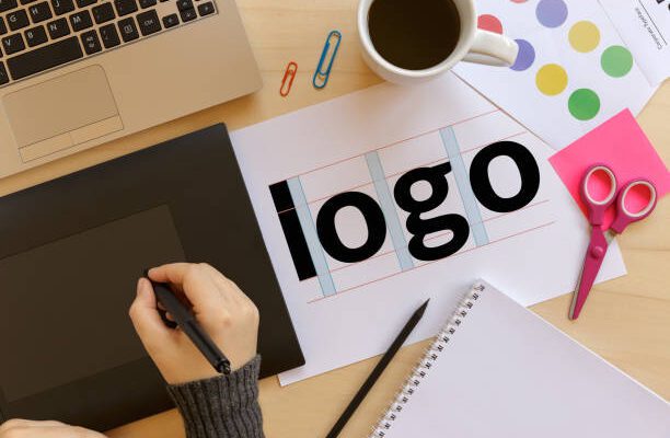
 (Photo from istock)
Another choice is to use your company’s logo to make a statement. Consider Amazon’s as an example. The smiley arrow represents both how happy customers are with their shopping experiences and the fact that the company provides everything from “A-Z.”
Following are a few tips you can use in logo designing:
Beginning With Your Story
Businesses are set up to make money, which isn’t the most poetic statement, but it’s the one you need to start with. If you want to run a successful business, you must be able to sell yourself just as well as your products. The majority of marketers nowadays agree that consumers connect with tales much more deeply than they do with your product’s core principles. What do you make of this? Your logo must tell a story in some way.
Before beginning to think about the design of this logo, take some time to analyse the history of your company. When we think of Coca-Cola, we image polar bears and enormous, white script lettering rather than a brown, carbonated beverage.
List the words that best describe your brand
Now that you have your plot, it’s time to switch your logo flow from tale to setting. Open Thesaurus.com and enter the keyword that best describes your product into the search field.
For example, if you work in the apparel industry, you might just type “clothes.” You’ll be surprised by how many of these words have descriptive synonyms. In order to conduct additional research and initiate new searches, you can click on these results as you select which words best characterize your brand.
Drawings Inspired by Those Words
After knowing why you’re doing it and having a few key words to help you, pick up a pencil and some paper, and start drawing any ideas that come to mind. Allow each fresh concept to grow on its own. Don’t lose up if the first few sketches aren’t flawless; instead, keep working on them while drawing inspiration from earlier concepts. These sketches may be focused on a shape, your company’s name, or both.
Use your buyer persona to test your top sketches
 (Photo from istock)
Take a step back and select the best three ideas once you’ve created a variety of sketches on paper. Don’t overthink it; instead, choose the designs that catch your attention repeatedly and present them to others.
These draughts should be distributed to trusted family members, friends, and colleagues. Bring these sketches, if feasible, to a person who most closely resembles your buyer persona, or ideal client profile. This gives you the most insightful critique of your artwork since it considers the perception of your brand by the general public, not just those close to you.
Refine the Drawing You Selected
Congratulations, you’re on the right track to having a killer logo! Once you’ve located the sketch you want to utilize, it’s time to polish it and conclude the story you began in Step 1.
To begin changing your logo, go back to the terms you initially discovered when utilizing Thesaurus.com in Step 2. Once you’ve chosen a sketch, think about which terms it still does not sufficiently depict. Use these to revise your sketch and incorporate the greatest aspects of the ideas you finally rejected.
Making Your Logo’s Layout with a Free Design Platform
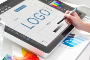
It’s time to get technical now that you have a digital copy of your paper drawing. Using one of the numerous available free design programme, you can recreate your sketch digitally. One of the most important aspects to do correctly is the layout. Make sure your text and objects are all correctly spaced apart and that your logo is aligned with its surrounds.
Your logo must be aligned in different contexts, even if it is not symmetrical. Instances of your brand being placed against different vertical and horizontal limits are likely to occur, regardless of how and where you might repurpose it.
Choose versatile color schemes for your logo
The time is here to combine text and images. If your organization’s name is mostly represented by a shape or symbol rather than text in the chosen sketch, start paying attention to it. If your company name ever appears alone without the symbol, consider the typeface that will be used for this text.
Surprisingly, the typeface you select can say a lot about your business. You can choose a serif font (each letter has a stem), also referred to as a classic or modern typeface, or a sans serif font (no stems).
Select a font for logo
The time is here to combine text and images. If your organization’s name is mostly represented by a shape or symbol rather than text in the chosen sketch, start paying attention to it. If your company name ever appears alone without the symbol, consider the typeface that will be used for this text.
Surprisingly, the typeface you select can say a lot about your business. You can choose a serif font (every letter has a stem), also referred to as a classic or modern style.
Maintain Scalability
In print, online, on each of your social media business pages, and throughout the internet as your company expands, logos are supposed to represent your brand on a variety of channels. A logo that can be blown up extremely large for a billboard and reduced down for screening onto the side of a pen is what you desire.
Regardless of the size, every aspect of your logo should be readable
 (Photo from istock)
You’re still with us, whew? We understand that this could sound a little intimidating, but proceed slowly and don’t push yourself. It’s preferable to follow the process through to the conclusion and have a spectacular brand than to have to restart a few months later because of a mistake in design or change of heart.


5 Comments on “How to design a logo that best represents your company”