
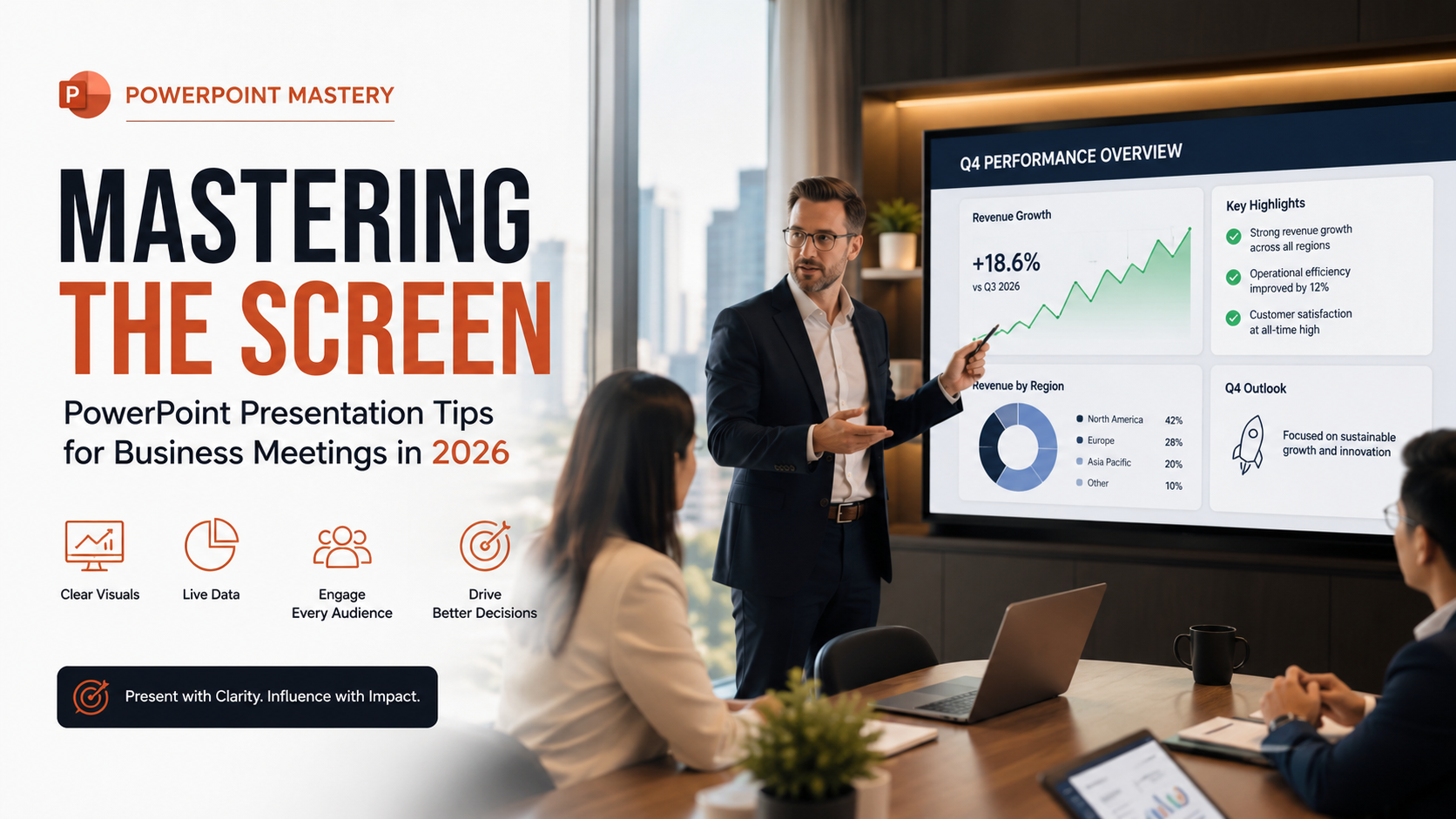
Mastering the Screen: PowerPoint Presentation Tips for Business Meetings in 2026
The corporate landscape has shifted permanently toward hybrid collaboration. Consequently, high-stakes communication is now more challenging than ever. To command attention in modern boardrooms, professionals must master advanced PowerPoint presentation tips. These specific techniques bridge the gap between physical and digital spaces seamlessly. Meanwhile, Microsoft continues to update its ecosystem via Microsoft 365 documentation. They frequently introduce sophisticated AI design tools and live data integration. Therefore, static, text-heavy slides no longer suffice for modern teams. Instead, corporate leaders need dynamic, engaging visual assets that drive decisions quickly.
This guide covers everything required to transform dry data into compelling business narratives. Specifically, we will explore structural frameworks, design principles, and modern technical features. These elements ensure your next pitch or quarterly review achieves its goals.
The Core Principles of Modern Business Slide Design


Embracing Minimalism and White Space
The era of the bulleted list wall of text is dead. In 2026, cognitive overload stands as a major threat to corporate productivity. Thus, simplicity is a premium design choice. When slides contain too much information, audiences stop listening to the speaker. They focus entirely on reading the screen instead. Therefore, you should use ample white space to let your design breathe. This whitespace guides the viewer’s eye naturally across the layout. Furthermore, keeping a single core idea on each slide helps your team retain information effortlessly. They will not get fatigued by massive text blocks. Minimizing elements forces you to select only the most impactful metrics. Consequently, this choice ensures your primary message stands out clearly. A clean layout indicates thorough preparation. Ultimately, it reflects a sophisticated approach that corporate stakeholders respect during alignment sessions.
Establishing a Clear Visual Hierarchy with Visual Presentation Tips
Visual hierarchy guides the viewer’s eye to the most critical information first. Hence, it establishes clear order on a busy slide layout. You can achieve this structural balance easily by varying your font sizes. For example, adjust your font weights and intentional asset positioning to create contrast. Primary elements like bold headers or massive data callouts must dominate the layout. As a result, they capture immediate attention upon slide transition. Secondary elements should sit lower in the visual order. These include supporting metrics, short labels, or brief context lines. Finally, accent elements use a single, distinct brand color. This color draws focus to a call-to-action or critical revenue pivot point. When you structure slides with clear visual pathways, stakeholders absorb the core data within three seconds. Consequently, conversations focus entirely on strategic decision-making.
Essential PowerPoint Presentation Tips for Business Meetings
Levering Live Data Integrations for Better Corporate Decks
Static screenshots of Excel spreadsheets look dated. Moreover, they risk displaying obsolete information during fast-moving corporate discussions. Modern corporate presenters use practical PowerPoint presentation tips like live data loops to maintain accuracy. Fortunately, you can link your charts to cloud-based data sources easily. Your slides will then update automatically in real-time as the underlying databases change. This practice ensures your financial reports and performance metrics remain perfectly accurate. Therefore, it completely removes the risk of presenting old numbers to leadership. Furthermore, it allows you to answer unexpected executive questions on the fly. You can refresh tables instantly without leaving presentation mode. Embracing automated data connectivity shows technical competence. Thus, it builds deep trust with data-driven leadership teams who demand real-time operational transparency.
Designing Slides for a Remote and Hybrid Audience

Hybrid work requires flexible slide layouts. These layouts must accommodate viewers sitting in the room and those joining remotely. Similarly, your presentation must look equally stunning on a large boardroom projector. It must also look sharp on a 13-inch laptop screen over Microsoft Teams. To achieve this, maintain high color contrast between your text and background elements. Good contrast guarantees readability across all corporate displays. Additionally, avoid placing critical data in the bottom corners of your slides. Video conferencing software overlay menus frequently block these areas for remote viewers. For this reason, test your color palettes on multiple monitors prior to the session. This step prevents washed-out visuals from ruining your delivery. Ultimately, prioritizing the remote experience ensures every stakeholder feels included, which directly improves collaborative engagement.
Implementing Interactive Slide Layout and Navigation Techniques
Linear presentations can feel incredibly rigid. They often slow down spontaneous business conversations when stakeholders want to skip ahead. Instead, build an interactive presentation using hyperlinked navigation menus. You can also use PowerPoint’s built-in Zoom feature to create a dynamic slide deck. If a stakeholder asks to see Q4 projections early, click an on-screen button. You can jump straight to that section without awkwardly scrolling through dozens of intermediate slides. Consequently, this non-linear approach transforms a rigid presentation into a collaborative, fluid conversation. It respects executive time explicitly. Moreover, it allows you to follow the natural flow of the meeting while staying organized. Presenting with interactive flexibility demonstrates complete mastery over your corporate content. Therefore, it leaves a lasting impression of professionalism and adaptability on your audience.
Crafting a Compelling Presentation Narrative
The “Hook, Line, and Sinker” Framework for Slide Decks
Every successful business presentation follows a deliberate narrative structure. This structure is designed to guide the audience toward a specific corporate conclusion. First, start with a powerful hook. This can be a surprising industry statistic, an inspiring vision, or an urgent operational challenge. These topics require immediate attention from leadership. Next, deliver the line by presenting your core strategy clearly. Use operational data or software-driven solutions in a logical sequence. Finally, close with a decisive sinker. This is a clear call to action that outlines the exact next steps. For instance, it covers budget requirements and project milestones for your stakeholders. This classic storytelling framework keeps your audience engaged from the opening slide to the final remarks. Thus, it ensures your presentation functions as an active strategic tool rather than a passive data dump.
Turning Complex Metrics into Memorable Slide Stories
Data by itself rarely inspires corporate action. Instead, context and narrative tension drive meaningful business decisions. Do not just state that operational costs fell by 12% last quarter. Rather, explain how your team optimized the supply chain to achieve those specific savings. Frame your numbers around a clear business journey. For example, highlight the initial obstacles, the strategic pivot, and the ultimate victory. This narrative technique makes your insights memorable. Furthermore, it is highly persuasive to executives who look past raw spreadsheets to find real-world business outcomes. Humanizing the data helps your audience connect emotionally with the project’s success. Consequently, it turns abstract metrics into shared organizational triumphs. When you wrap your analytical findings in a structured story, you make the information accessible to everyone.
FAQ SECTION
What is the 10-20-30 rule for PowerPoint presentation tips?
The 10-20-30 rule is a classic presentation guideline. Guy Kawasaki popularized it to prevent cognitive fatigue during pitches. Specifically, it states that a presentation should contain no more than 10 slides. It should last no longer than 20 minutes. Moreover, it must use a minimum font size of 30 points. Applying this rule prevents presenters from overwhelming their audience with too much information. Thus, it forces you to focus strictly on your most impactful points. Business meetings in 2026 require some structural flexibility for complex data streams. However, keeping this rule in mind ensures your decks remain concise, readable, and highly focused. It encourages speakers to internalize their talking points. Consequently, they will stop reading long paragraphs directly off the screen. By restricting slide volume, you leave ample time for valuable strategic questions. This approach transforms a dry lecture into an active corporate alignment session.
How can I make my corporate slides look professional quickly?
The fastest way to look professional is to enforce strict visual consistency across your deck. First, limit your palette to three or four colors. Use your core brand colors as a foundation to build visual identity. Next, use standard, highly readable typography like Arial, Segoe UI, or Aptos. Avoid decorative fonts that degrade on low-resolution boardroom projectors. Afterward, ruthlessly eliminate bullet points. Replace them with clean grid layouts, icon arrays, or bold metric callouts. Surround these elements with generous white space. Additionally, ensure your assets align perfectly by using PowerPoint’s built-in Align and Distribute tools. This step removes sloppy layout variances instantly. Finally, increasing the spacing around your text blocks elevates the overall aesthetic. It makes the information scannable for busy executives. Professional slide design relies heavily on subtraction. Therefore, removing decorative clutter instantly gives your deck an elegant, premium look that commands authority.
What font size is best for business slide presentation tips?
For standard business meetings, your slide titles should be between 36 and 44 points. This range establishes immediate structural authority on the screen. Meanwhile, your main body text or data callouts should stay between 20 and 24 points. These sizes guarantee readability on smaller displays. For instance, remote workers frequently use mobile devices or tablets to join sessions. Never use a font size below 18 points for core presentation text. Small text strains the audience’s eyes and looks highly unprofessional. If you find yourself forcing text into smaller sizes, it serves as a clear warning sign. Your slide contains too much data and needs to be split across multiple layouts. Fortunately, adhering to these size guidelines forces you to edit your copy down to its absolute essence. It ensures your presentation remains punchy, clear, and accessible to everyone in the boardroom.
How do I handle technical glitches during a business meeting presentation?
Preparation remains your best defense against technical failure during live hybrid presentations. First, always save a local PDF copy of your presentation to your device. You should also maintain a cloud backup on secure networks like OneDrive or SharePoint. If the live PowerPoint software freezes, you can switch to the PDF smoothly. The internet might drop out unexpectedly, but this backup prevents you from delaying the meeting schedule. Additionally, log into your video conference call ten minutes early. Use this time to test your audio feeds, video clarity, and screen-sharing permissions. If a glitch occurs during the session, stay calm. Acknowledge the issue briefly and pivot to your backup files to maintain complete professionalism. Therefore, handling technical difficulties with a composed attitude demonstrates leadership under pressure. It reassures stakeholders that you can manage unexpected operational challenges seamlessly.
Should I use animations in high-stakes corporate slide decks?
Yes, you should use animations while following professional PowerPoint presentation tips. However, you must apply them with extreme restraint to avoid distracting your audience. For example, subtle, functional animations like Fade or Appear help control the flow of information. They reveal data points one at a time. This pacing keeps stakeholders aligned with your spoken remarks. Furthermore, it prevents the audience from reading ahead and missing critical context. However, complex, flashy transitions like Bounce or Fly In look unprofessional. They actively detract from your authority. Keep all transition durations under 0.5 seconds. Fast transitions ensure your presentation feels crisp, snappy, and executive-ready. When applied correctly, animations function as visual punctuation marks. They guide attention to key revenue changes or strategic pivot points. They achieve this without turning your corporate deck into an unnecessary visual spectacle.
CONCLUSION
Mastering modern PowerPoint presentation tips is essential for any professional today. These strategies help you drive meaningful organizational change. In 2026, effective presenting requires moving past outdated, text-heavy layouts. Instead, you must embrace clean, data-driven visual storytelling that respects audience attention spans. By focusing on minimalist design principles, you keep hybrid audiences engaged. Furthermore, building interactive, flexible navigation ensures you create presentations that command respect across all digital channels. Clear visual communication reduces friction in the boardroom. Consequently, it allows diverse stakeholders to understand complex operational strategies quickly and align on key performance metrics.
At its core, a presentation is simply a tool to amplify your expertise. It moves your business strategy forward efficiently. If you want to streamline your workflow outside the boardroom as well, implementing time-saving tips for weekly activities can free up valuable hours for slide design. Ultimately, the structural choices and design habits you implement today directly shape how stakeholders receive your ideas tomorrow. They influence project funding and organizational buy-in heavily. Therefore, focus on clarity over complexity at all times. Treat your data as a narrative journey. Finally, ensure every slide serves a distinct strategic purpose. Take these advanced PowerPoint presentation tips into your next corporate briefing to deliver your message with absolute confidence, authority, and measurable impact.